Tampax
Tampax
Brand Identity
Brand Identity
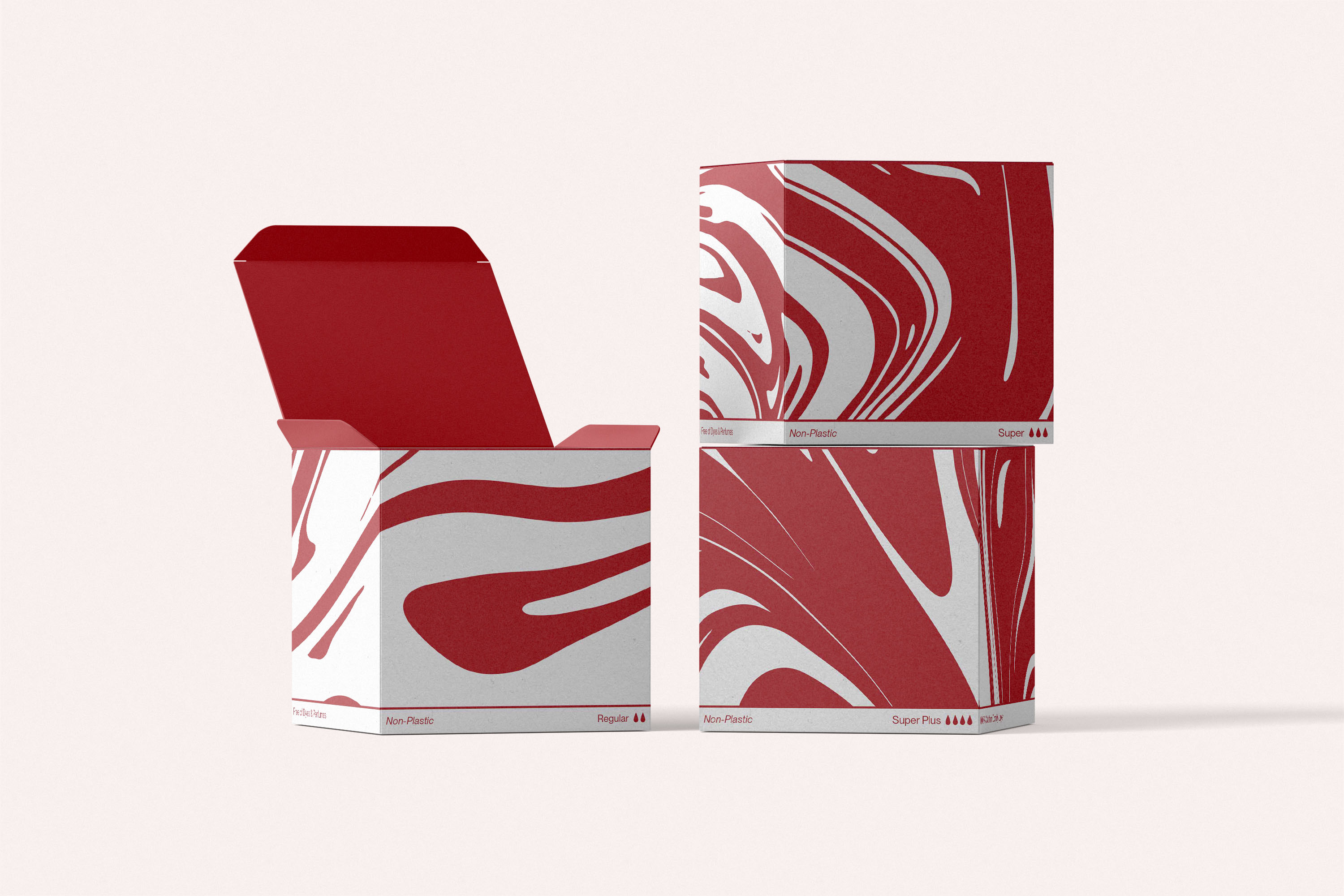
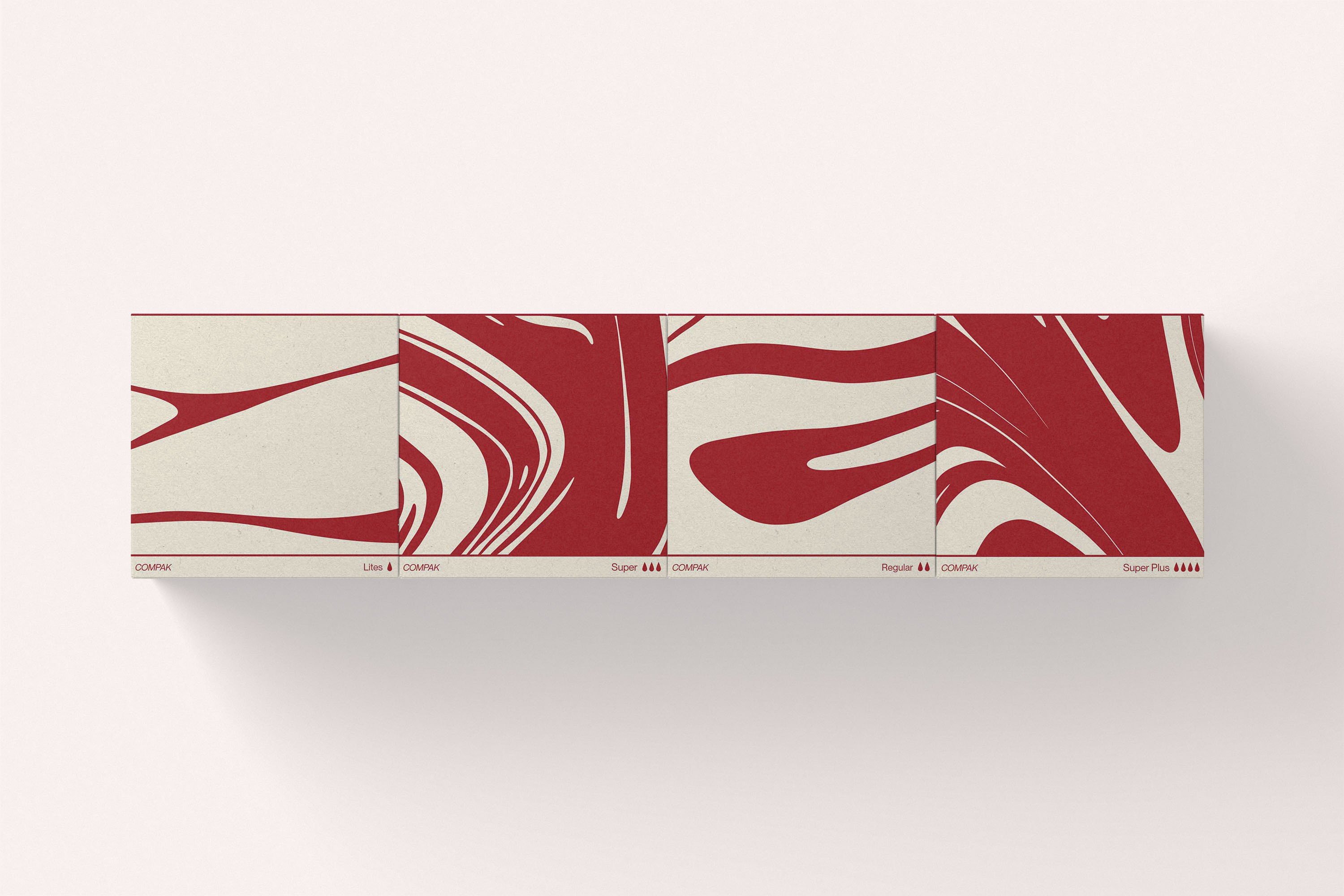
Menstruation is often shrouded in shame and stereotypes. This culture of concealment is embedded in design as well: generic branding, ineffective colours, and euphemistic language. But menstruation is not blue, floral, or discreet. It’s red, vital, and real. Rather than perpetuate stigma, the design can be used as a tool for cultural reframing. The rebrand embraces red as a bold testament of truth and pride. A fluid-like red pattern visually signals the absorbency level. This intuitive system replaces outdated, small iconography with a graphic language that users can understand at a glance. Visibility, both literal and symbolic, can become a tool for acceptance.
Menstruation is often shrouded in shame and stereotypes. This culture of concealment is embedded in design as well: generic branding, ineffective colours, and euphemistic language. But menstruation is not blue, floral, or discreet. It’s red, vital, and real. Rather than perpetuate stigma, the design can be used as a tool for cultural reframing. The rebrand embraces red as a bold testament of truth and pride. A fluid-like red pattern visually signals the absorbency level. This intuitive system replaces outdated, small iconography with a graphic language that users can understand at a glance. Visibility, both literal and symbolic, can become a tool for acceptance.